
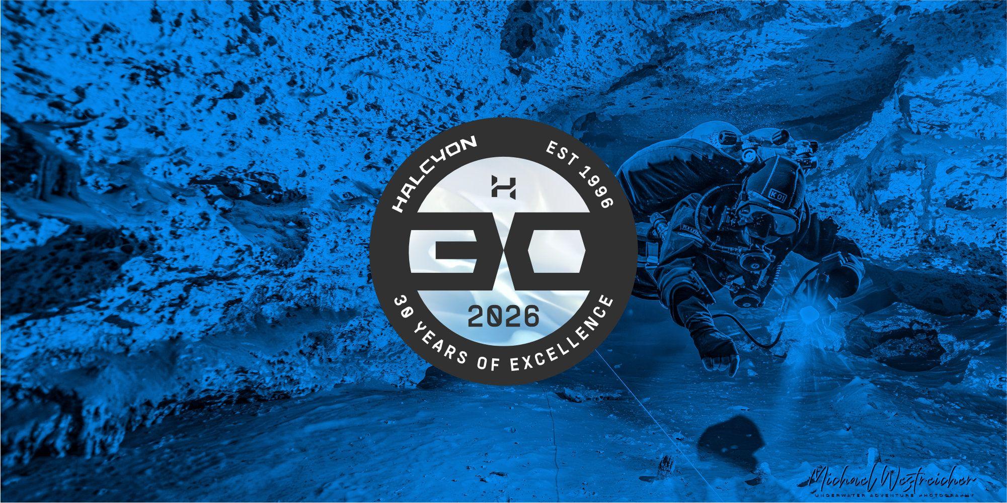
Cover photo by Mıchael Westreicher
Celebrating our thirty-year milestone at Halcyon would not be complete without creating a visual mark that represents this special anniversary and our commitment to design, reliability, excellence, and forward thinking.
The idea for an anniversary logo started with something elegantly simple. In traditional anniversary terms, a pearl represents thirty years of commitment to a relationship. That felt like a natural fit, both symbolically as well as in how it reflects Halcyon’s evolution.
A pearl forms underwater, slowly, layer by layer, shaped by pressure and time. That process mirrors how the brand has grown.
Halcyon was built step by step—through diving, teaching, testing, and refining. That rigorous process brought gear that is used by real divers in real conditions, across a wide range of environments. Each iteration reflects real use in the underwater realm and augments the original design.
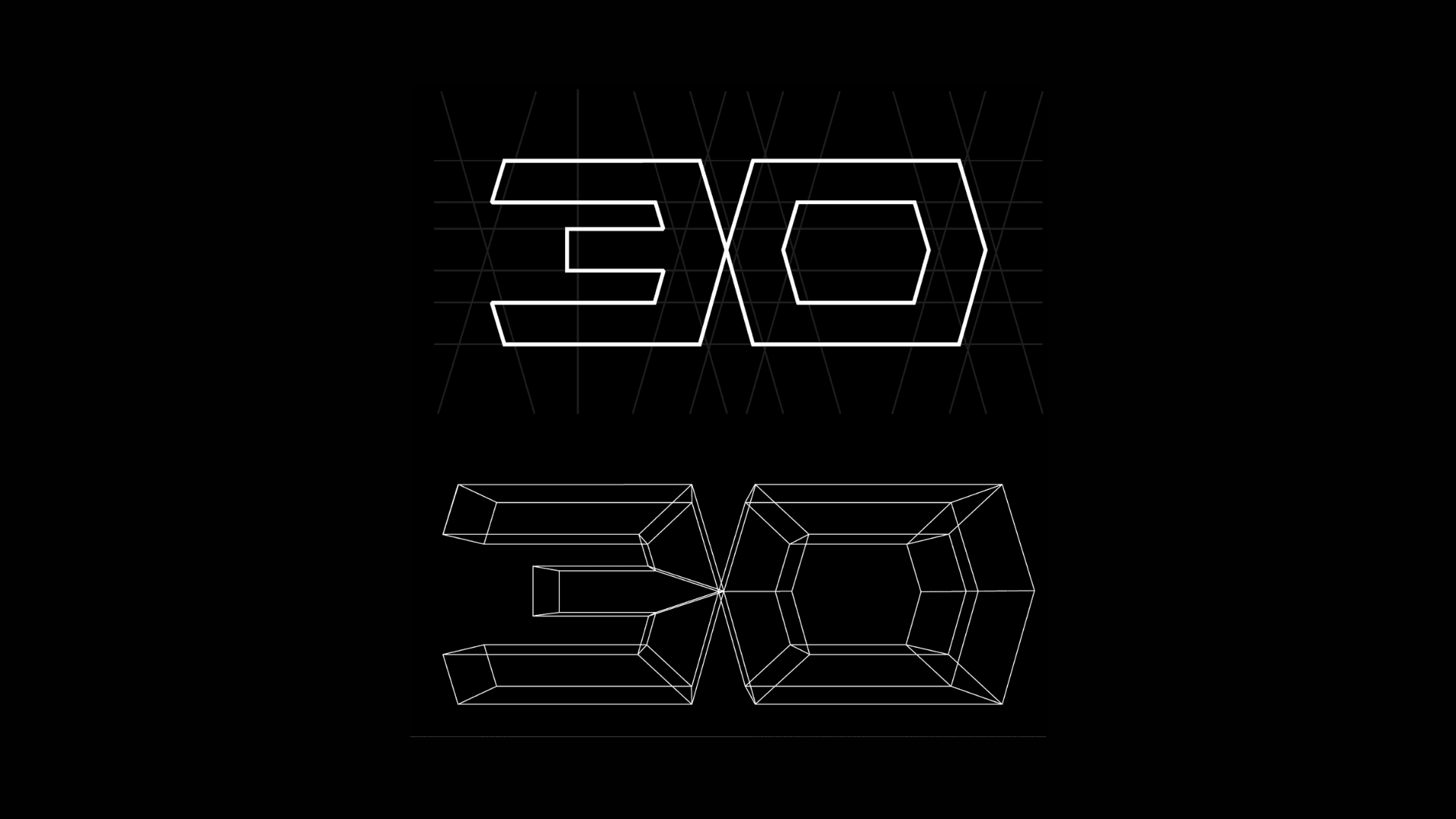
Early sketches of the logo
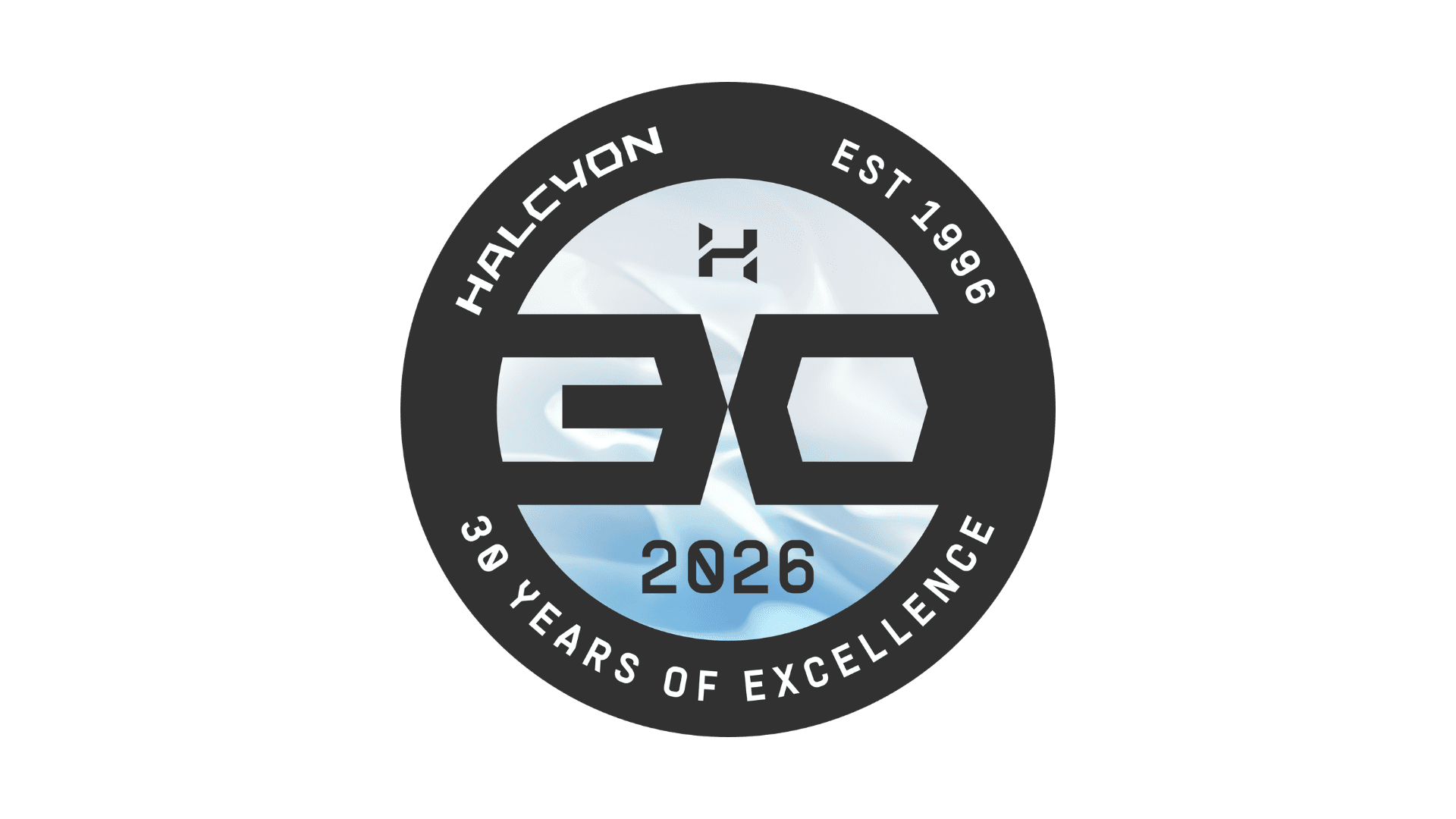
The design process followed a similar path. Early sketches explored the structure of the “30” itself to be clean, geometric, and almost technical in form. From there, the idea evolved into something more contained and complete, leading to the circular mark and the concept of a pearl held within its shell.
The final logo reflects that thinking. A simple, circular form that feels continuous, with subtle layering that comes through in the details. The inner surface introduces a softer, more organic element, balanced by a clear outer structure.
It’s not meant to stand apart from the brand, but to sit naturally within it.
This identity will not remain as only a graphic. Over the coming months, it will carry over into a limited-edition collection of Halcyon products, where the same ideas take shape through considered design details and finishes.
Thirty years in, the approach remains the same: design, then build gear we trust and let that guide what comes next.
If you’d like to follow along, subscribe to our newsletter below.